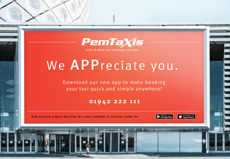
Pemberton Taxis got in touch to discuss a new billboard design to advertise their new APP.
After looking at the existing brand the client felt they should refresh it and then we could use the billboard to launch this as well.
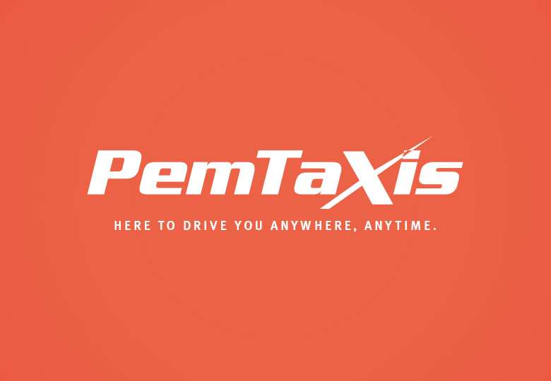
Firslty the name was shortened to PemTaxis. Then a clear and simple tagline was created that allowed customers to gain a sense of a much wider operating area to encourage them to book. Making it too geo based could deter some of the bigger bookings.
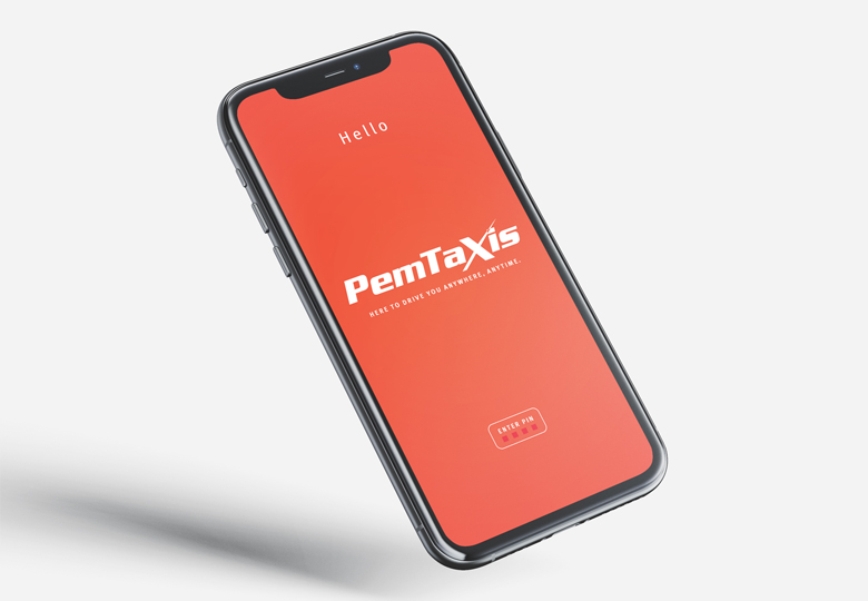
The logo is fresh and modern. The colour was chosen to reflect this and make it stand out from the competiton.
I wanted to make the company look approachable, not looking like a late night cobbled together taxi firm which didn’t look safe and caring, but a brand that was there for you all day and night always putting you first.
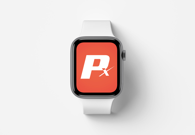
The logo has a sense of movement and directions scaling down nicely to create an icon to use on cars and the app button remaining coherent thus building brand awareness every day.