The Thomas Partnership have been a loyal and brilliant client for over 15 years.
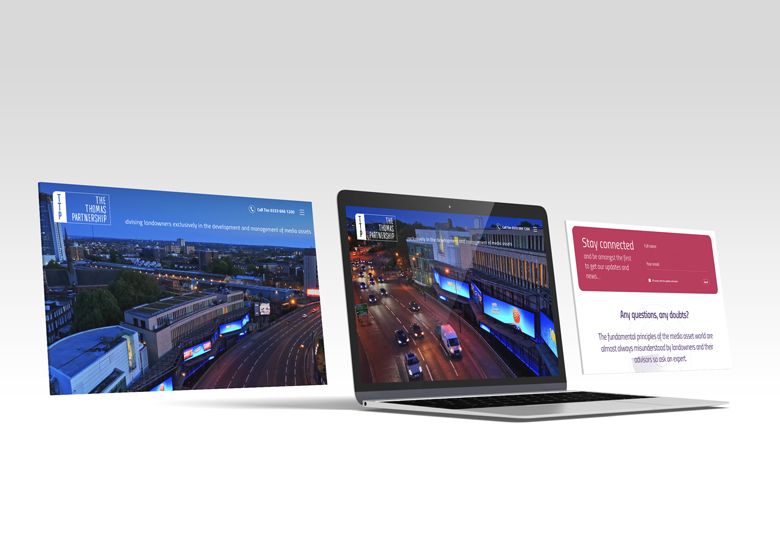
Rebranding TTP this year was about upgrading to a fresh, minimal and impactful identity with a nod to the past. Too much change could lose you the clients you have built your business on.
Using white space, drone footage, images and typography to create clear messaging and navigation, quickly engages and guides potential clients through the Who, What & Why of TTP. Confuse you lose.
Having a client that was brave enough to ditch 90% of their old content and embrace saying just enough was a strong starting point for the TTP brand to have clarity. Your clients want simplicity to understand your services and products quickly, help them by removing the clutter of saying too much.
Little details throughout maintain the engagement and the results and feedback have been beyond expectations.
Click to visit…

